Daily sketches 1-30
About a month ago (14 September 2017), I started a series of daily generative art sketches. My goal was to play around with some abstract aesthetics, without getting too bogged down in the details of any one project. Every day, I generate a single image, post it to Twitter and Instagram, then move on. Sometimes I build on what I did the previous day, other times I start from a clean slate. I don't have any strict rules, but everything so far has stuck to pure code (no input data), and I'll probably stick with that for a good while.
I have no intention of stopping just yet, but I thought thirty days was a good point at which to look back and take stock of what I've done so far.
A technical note
My goal here isn't to talk about the technical details, but in order to head off the inevitable questions, here are some basic facts:
All of the code is in Clojure, using the Quil library, which is a light wrapper around Processing. Most days, the script is 20-40 lines of code, but I do have a personal library of reusable functions which includes a few hundred lines of utility functions for various tasks. Really, there's nothing here that you couldn't do in any language, with any framework that allows you to draw shapes on a canvas. However, Clojure is well suited to this sort of thing - it gently promotes small reusable chunks of code, while allowing you to do god-awful hacks when you feel like it.
The code is not open source. It's deliberately bad code, which nobody should be trying to reuse. Also, I have complicated feelings about how the collaborative nature of open source interacts with creative coding and art. Nevertheless, if you really desperately want to see the code, it's available to $5+ contributors to my Patreon.
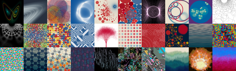
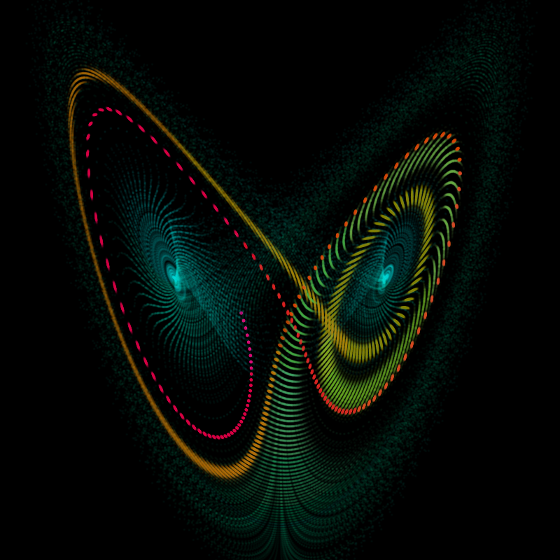
Lorenz attractors
I started with some sketches of a Lorenz attractor. This has been my go-to warmup exercise for any kind of graphics coding for as long as I can remember. It's simple enough that you can code it up in any language in less than a screenful of code, but complex enough to produce some gratifying visuals when you get things working. I think I first came across it as a teenager in James Gleick's book Chaos: Making A New Science, and coded it up in QBasic. Honestly, I should probably change things up a little, try something else once in a while.
The second image here was coded while watching the final minutes of the Cassini space probe as it burned up in Saturn's atmosphere. There's a visual and mathematical similarity between Saturn's rings and the Lorenz attractor - they're both chaotic orbits, with gaps formed by resonances. However, I think you'd probably get a similar visual effect by just drawing a bunch of ellipses at random.
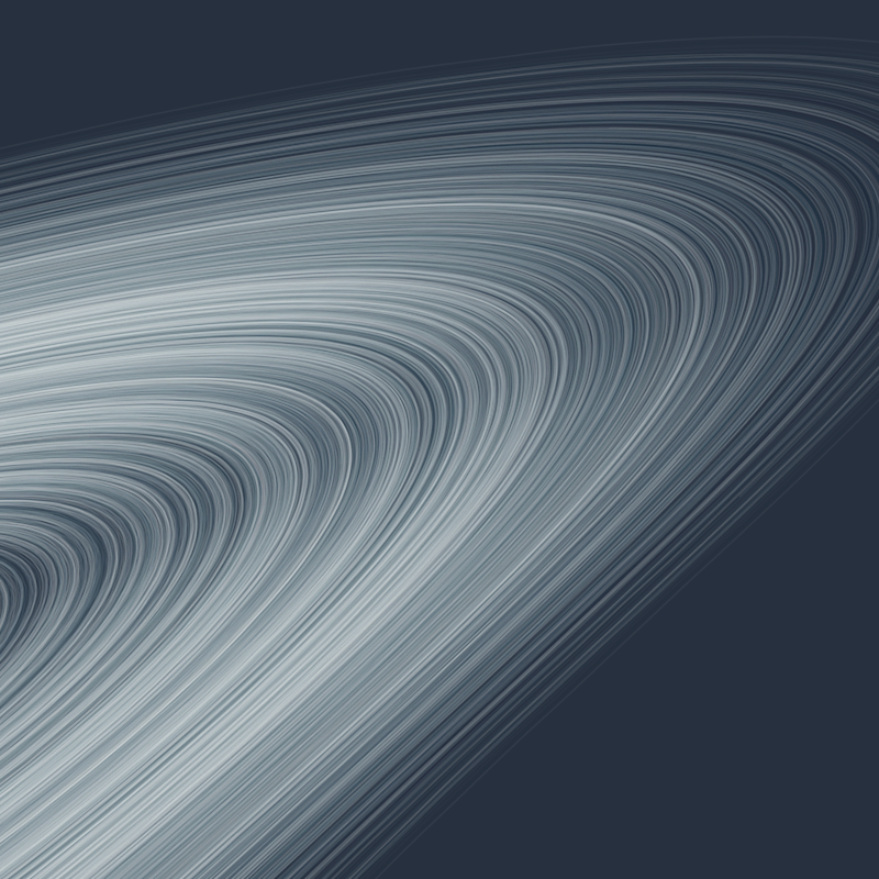
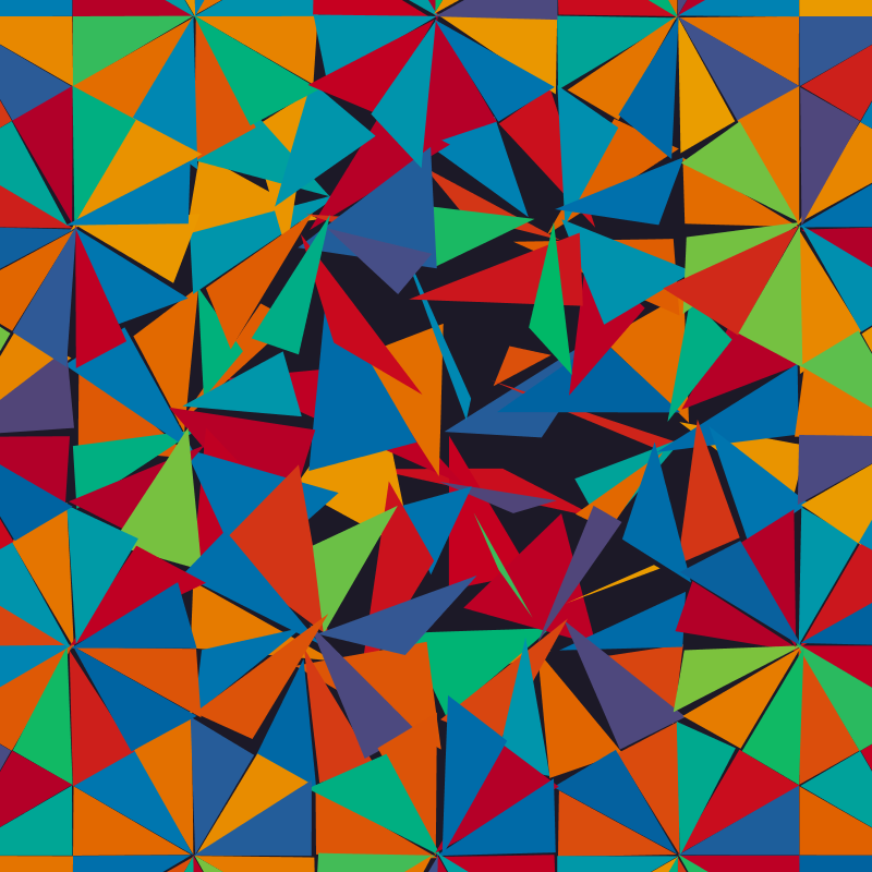
Circles
The first image in this series was chasing after the aesthetic of old geometry textbooks. I've always been fascinated by Euclidean geometry as a branch of mathematics. It was developed in depth by the Greeks, and was a key part of mathematics right through to the 19th century. We still teach it in schools as a sort of introduction to ideas about proof, but at the research level it's considered a solved subject, and when we do have to solve geometric problems in the plane, we use the analytic formalism of vectors and coordinates (due to Descartes in the 1600s).
There's something wonderfully visual about working in the pure Euclidean style, manipulating diagrams of intersecting lines and circles. It's a very logical, axiomatic process, but it somehow resists being written down in words and symbols. Because of this, it's rare to see it on computers, which are very much children of Descartes. I wanted to play with this - the scale of computers, allowing near-infinite repetition, sits in a nice contrast to the more human style of the Euclidean diagram.
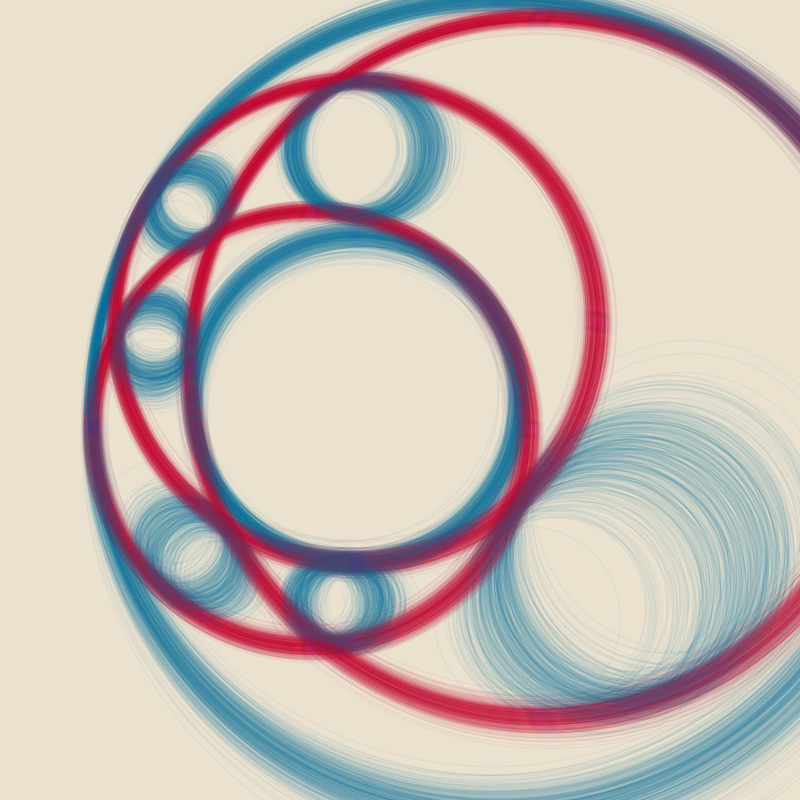
After this, I got interested in the ways of representing a circle. Usually on a computer we use center coordinates and a radius, describing something like \((x - x_0)^2 + (y - y_0)^2 = r^2\). This works, but it doesn't allow for one of the final great leaps in Euclidean geometry, the unification of lines and circles, as on the Riemann sphere. If instead we use a homogeneous form like \(a(x^2 + y^2) + bx + cy + d = 0\), then we can make lines with \(a = 0\) and circles with \(a \ne 0\).
This image was formed by interpolating between circles in this representation - there are two possible paths, depending on whether the corresponding values of \(a\) have the same or different signs, and this can lead to the circles being turned inside-out on their path from one to another. The gaps are formed when the circles become close to straight lines - at this point the machine precision starts to do funny things.
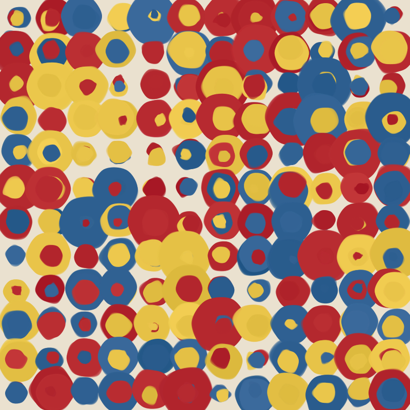
It turns out that this representation makes it relatively straightforward to perform a circle inversion, so I played with that for a bit. The first image shows a Cartesian grid inverted in a circle - I really enjoy the patterns of negative space formed by the overlapping disks. In the second, I inverted a standard hexagonal circle packing, producing a much more interesting texture of circles receding into infinity.
Tangents
These next three explore the idea of tangency. In art, tangents are usually a thing to be avoided. They produce a sensation of unease, drawing attention to points where things touch without overlapping. There's something powerful about that idea, which I wanted to play with.
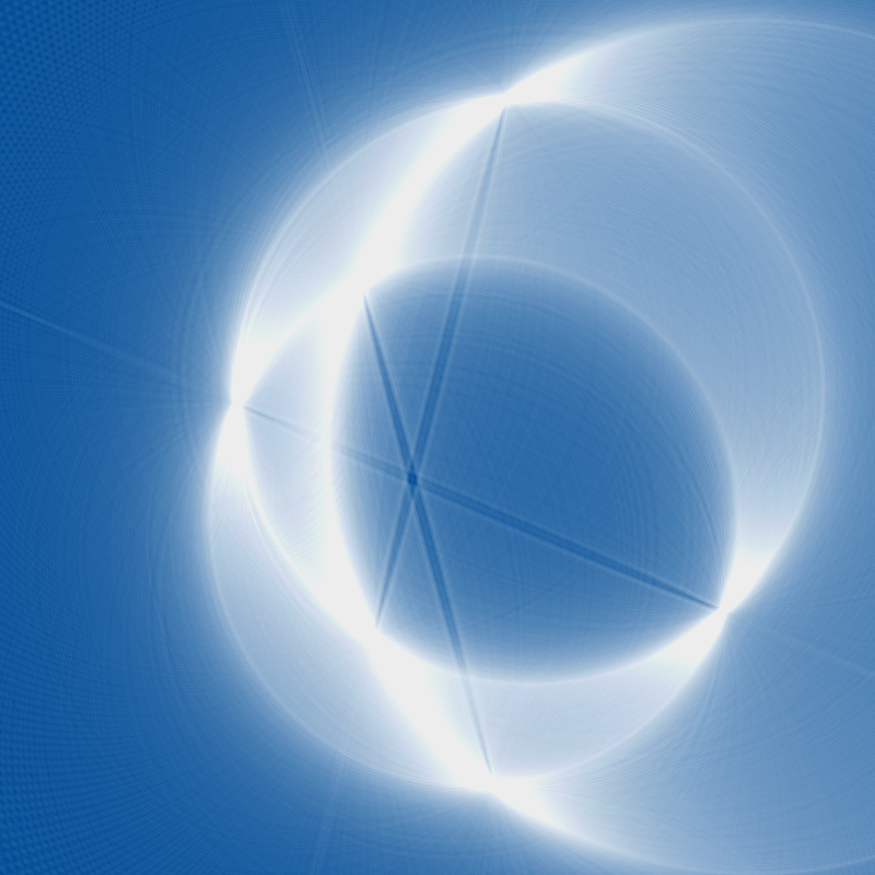
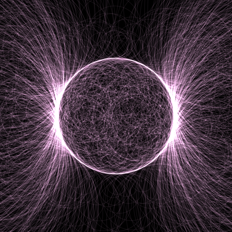
The first image was inspired by something Zach Lieberman said in his Eyeo 2017 talk about drawing a circle by absence - picking random lines, and only drawing them if they don't intersect a particular circle. In this case, instead I pick random points, and draw the smallest circle around them which is tangent to a particular circle. This produces an unexpected contrast between the fairly uniform texture inside the circle, and the wild, plasma-like filaments outside.
The second image is one of the classic geometric problems, the Problem of Apollonius: finding the eight circles which are tangent to all three given circles. This is fiendishly difficult, but still possible using classical compass/straightedge techniques. I was interested in ideas about imprecision here, how varying the given circles leads the tangent circles to become fuzzy and indistinct.
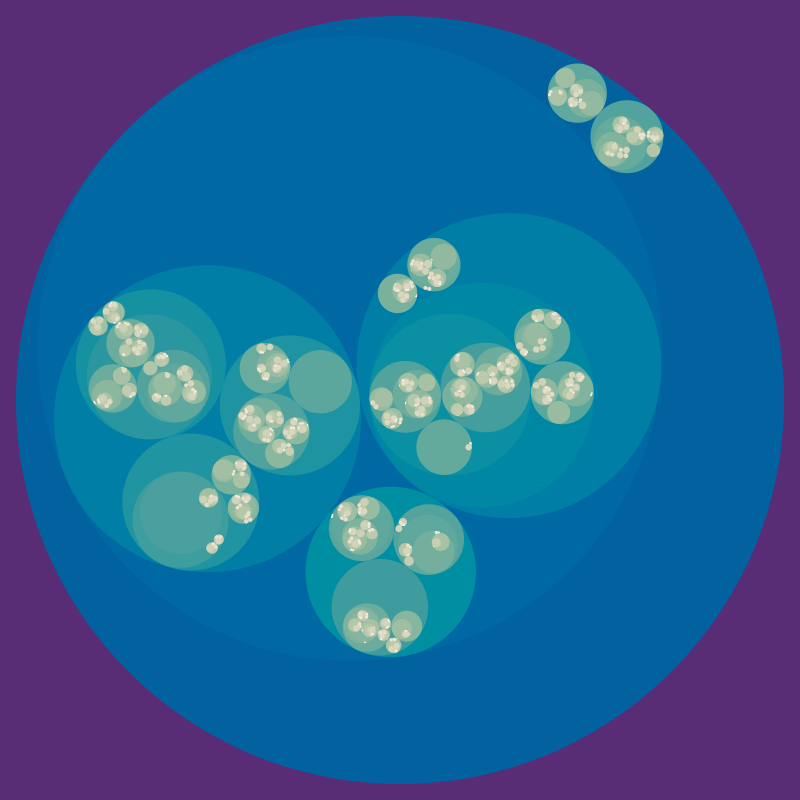
The final image is an attempt at a circle packing algorithm. The code was buggy, but I like the organic feel, like fungus in a petri dish.
Schotter
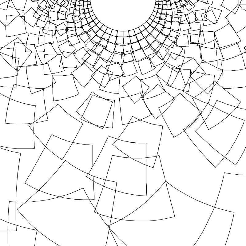
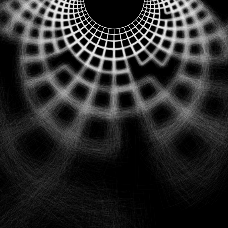
These two are variants on Georg Nees's "Schotter", an early work of computer art. I wanted to experiment with moving the Cartesian grid of Nees' work onto a curved surface. By inverting the pattern in a circle, now we have disorder spilling outwards from an ordered center, and the rigid squares have become curved shapes, much less uniform to the eye, but equally constrained by geometry.
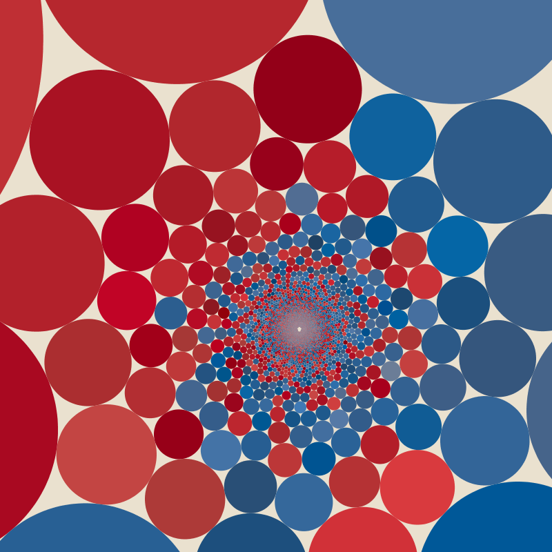
Circle textures
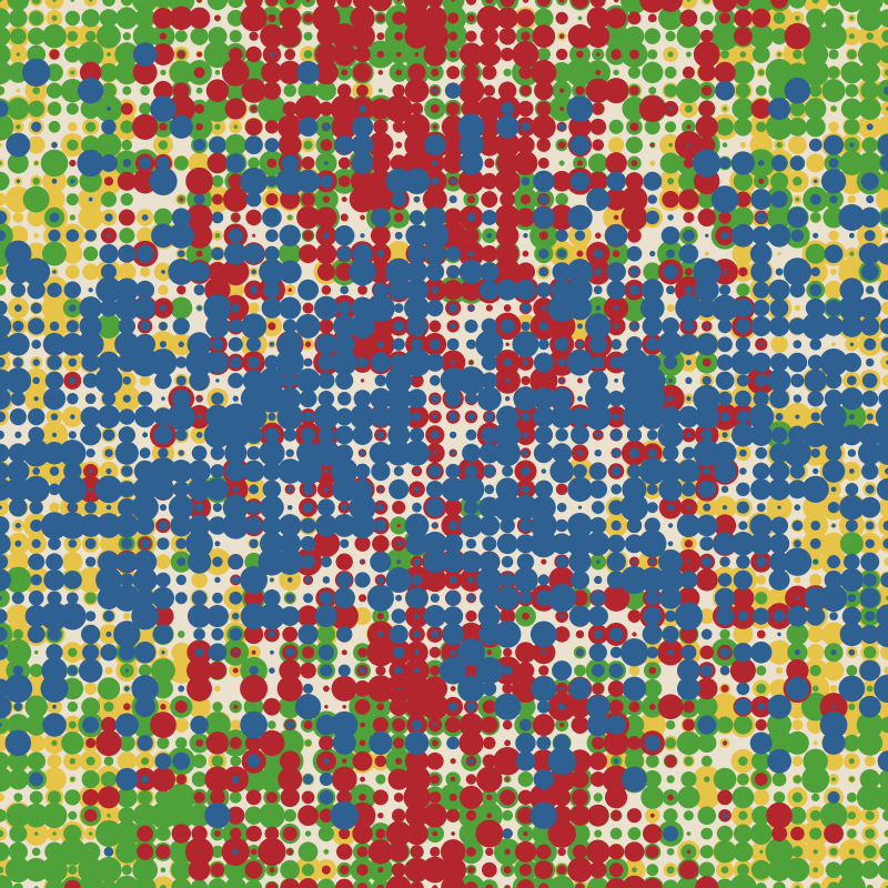
After all this geometric formalism, I decided to ignore shape, and have some more fun with texture and colour. I wanted to revisit the negative space produced by the overlapping disks in one of the earlier images. I don't think I really captured it again here - I think the curved grid is necessary to break up the obvious linear structure.
Fractals
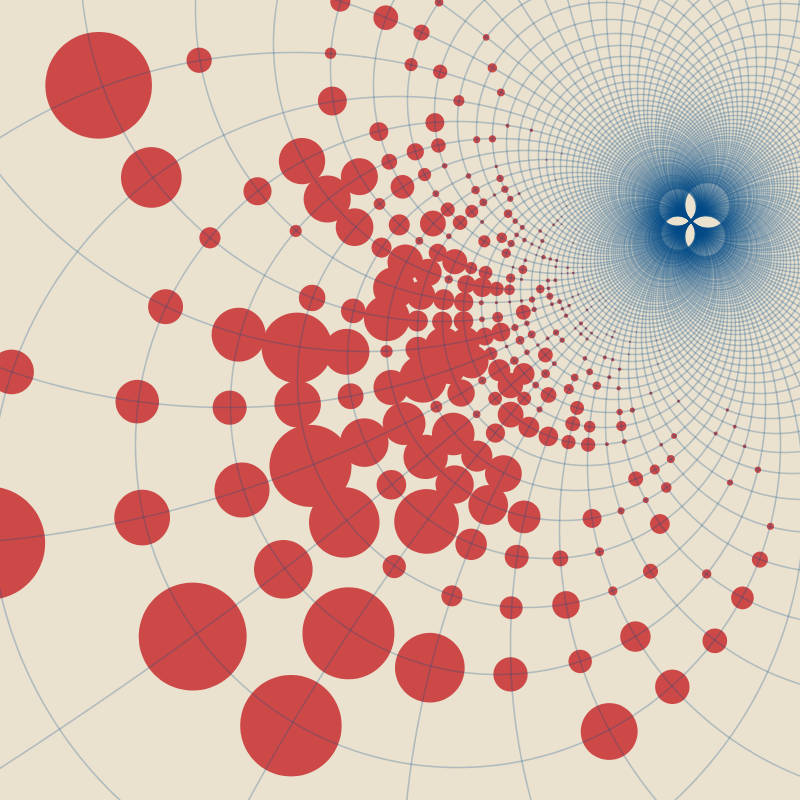
I lasted nearly two weeks into daily generative art pieces without (explicitly) drawing a fractal.
The first piece here is a variant on the "famous" Commodore 64 program 10 PRINT CHR$(205.5+RND(1)); : GOTO 10. Rather than repeating the same slash pattern down the screen, I had it repeat at finer and finer scales. The resulting pattern has a glitchy feel to it which I quite like, and it preserves a lot of the maze-like quality of the original, without actually being a maze in any meaningful sense.
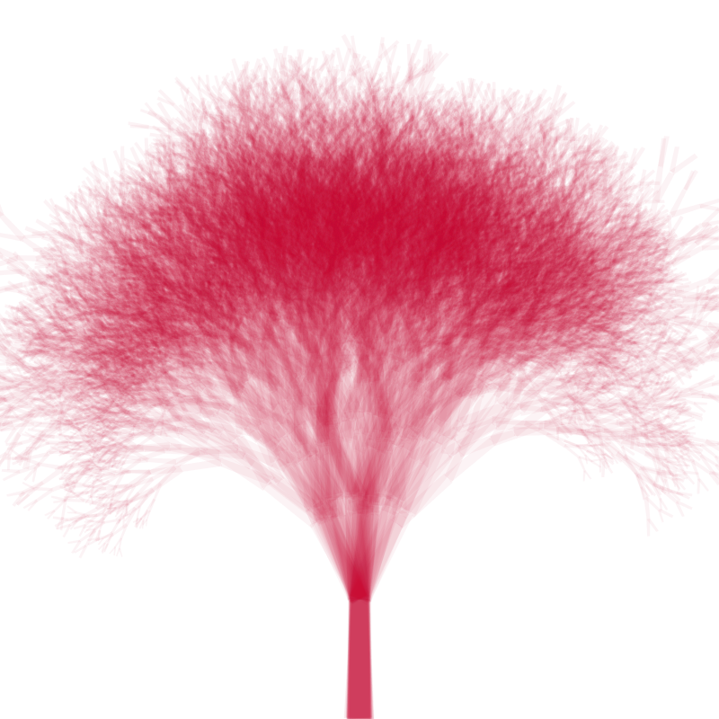
The second piece is an overlaid sequence of fractal binary trees. I'm not sure what I was going for, to be honest, but I like the contrast in texture between the smudgy area at the top of the trunk, and the spidery branches.
These rose patterns were originally going to go in a fractal grid, like the previous piece. However, I decided I preferred them as-is, with the structure coming from the left-right gradient in complexity.
Two more variants on the fractal grid. The first attempts to take the 10 PRINT pattern from earlier and make it more geometric, less computery, with a bit of a retro twist. The second tries to soften up the whole thing, with warm blobs of colour. I really like this one.
Waves
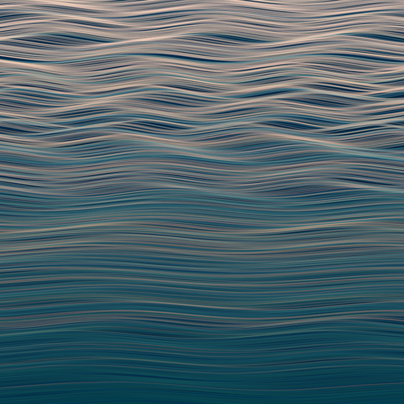
I live by the sea, and this was an attempt at capturing some of the feeling of looking out over the water, just after sunset. The image is composed of stacked sine waves, with the parameters of the wave varying randomly as we move down the image. It's perhaps clichéd, but I find it very soothing to look at.
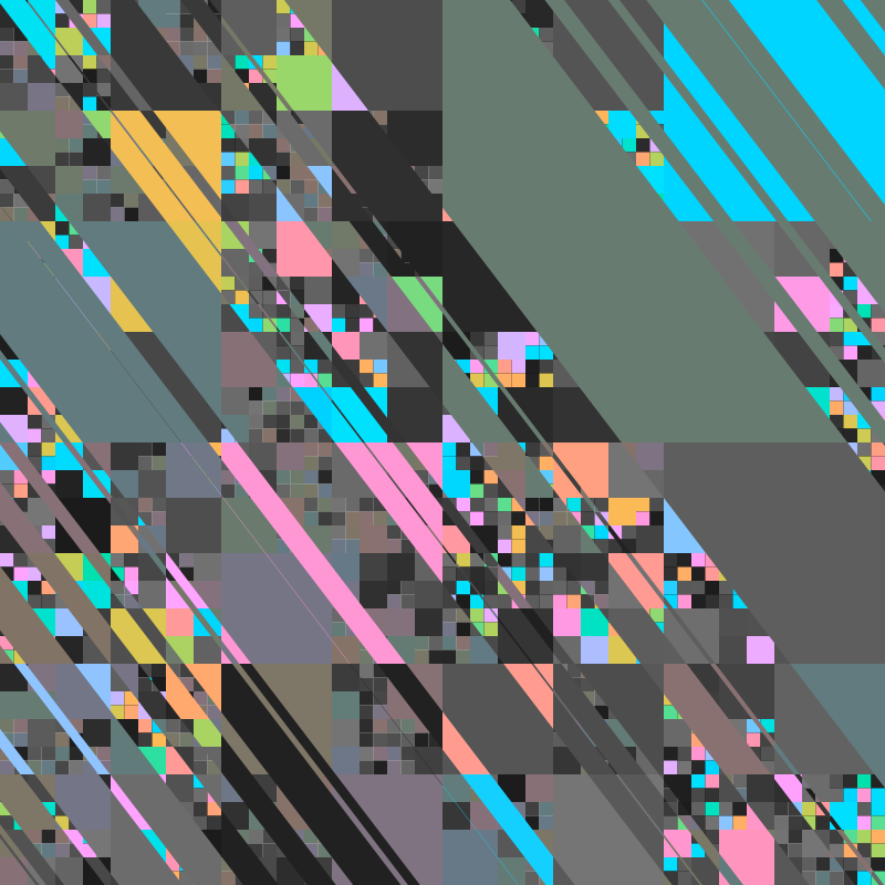
Tiling
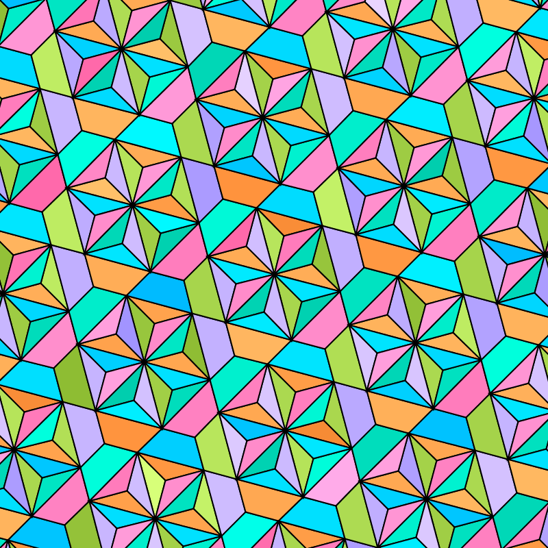
These two were playing with triangular tilings, Conway's kisrhombille, and a tiling where I just typed in coordinates until I had something I was happy with. I enjoy the kisrhombille tiling because it seems just slightly too complex to hold in your head all at once. Like the rabbit-duck, different symmetries of the tiling pop out depending on how you look, and where you rest your eyes. The shattering in the center provides a focal point, allowing your peripheral vision to absorb the full pattern, without being drawn to any particular elements.

For these, I tried using tilings to mask out sections of the image. The first image is based on the wave image from earlier, contrasting "day/night" versions of the same image. I'm not sure it adds anything really, but a fun experiment.
The next was an attempt to do something like Tyler Hobbs' Isohedral series. I think it was pretty successful, but maybe a bit derivative as a piece in its own right. Still, I like the warmth of the image.
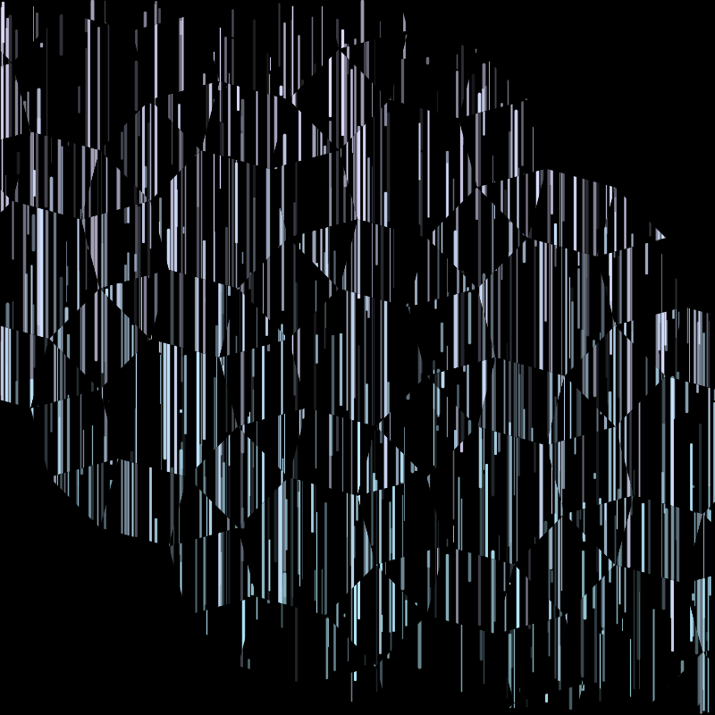
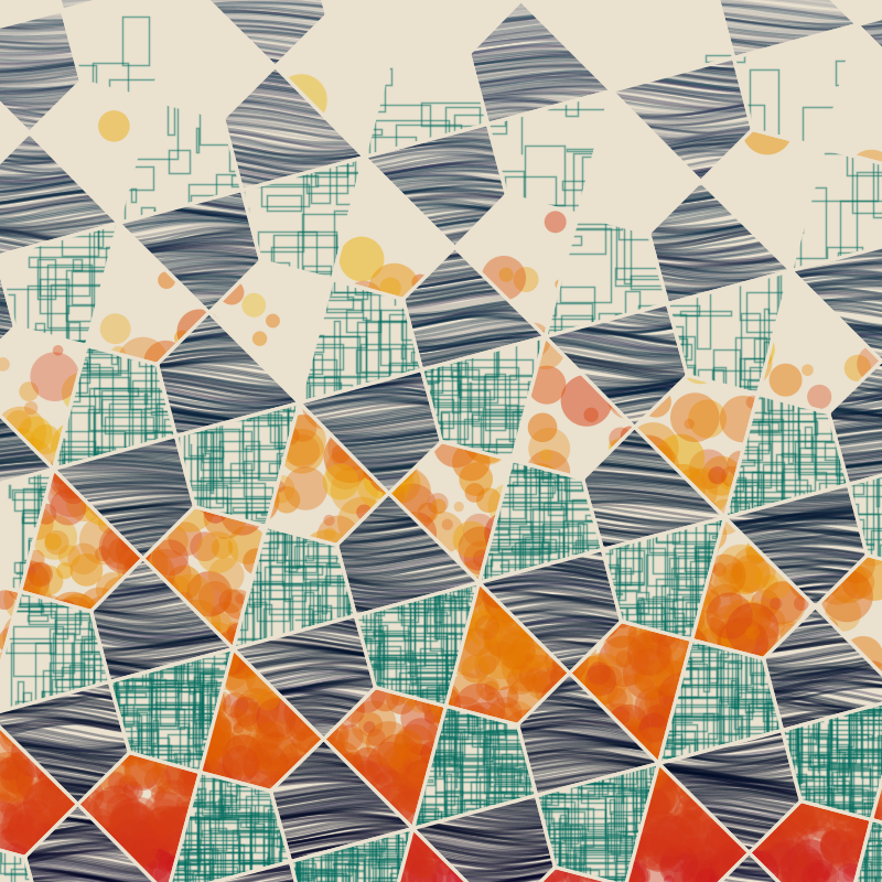
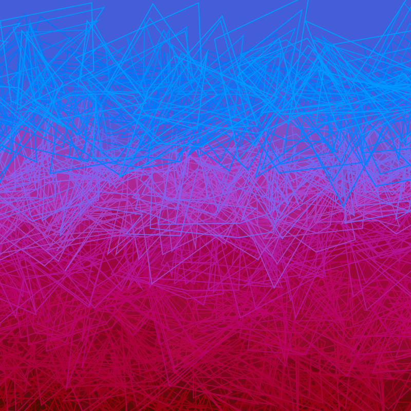
I played here with a scratchy "rain" pattern, trying to add some more texture. The first image was supposed to have a strong contrast between the bright streaks and the dull background, but it didn't work at all.
For the second image I was looking at making the tiling less obvious - here the "rain" pattern uses a different random seed on different shapes of tile. The overall effect is of looking through textured glass.
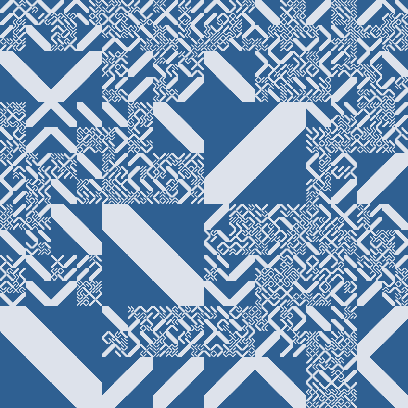
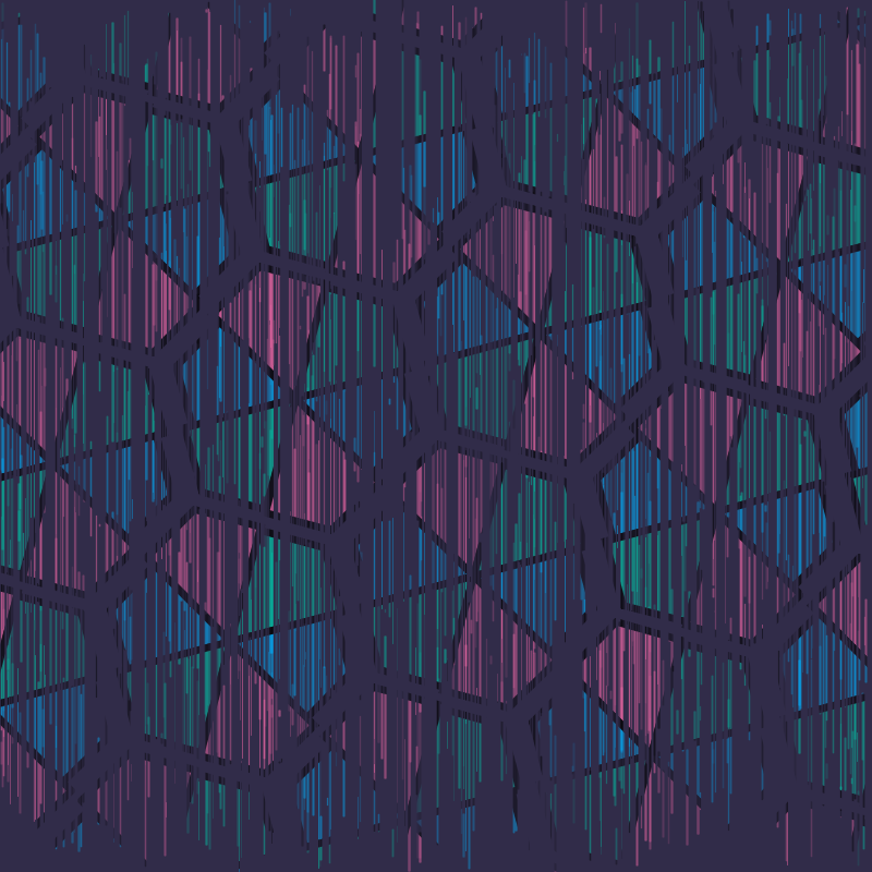
Glitch aesthetic
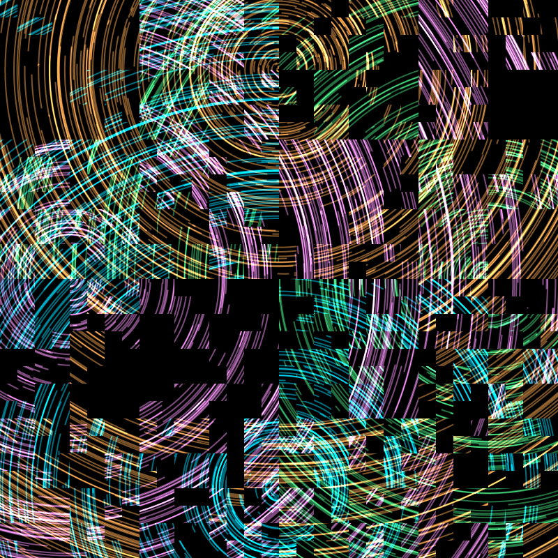
For these two, I was interested in exploring "glitch" aesthetics. I have to admit that I don't really understand the fascination with actual glitch art. Mostly it just feels like it's exposing details of how (for example) JPEG compression works, which is not all that interesting to me artistically. However, there is an interesting textural effect, where a blocky pixelated structure is contrasted with the high-frequency detail of the original image.
Here I tried to use the fractal grid pattern from earlier to replicate this block structure. I kind of like the results, although I'm not sure how to take this further.
Soft textures
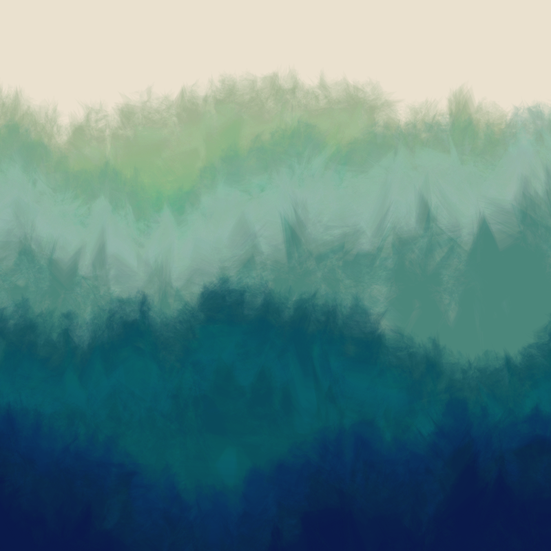
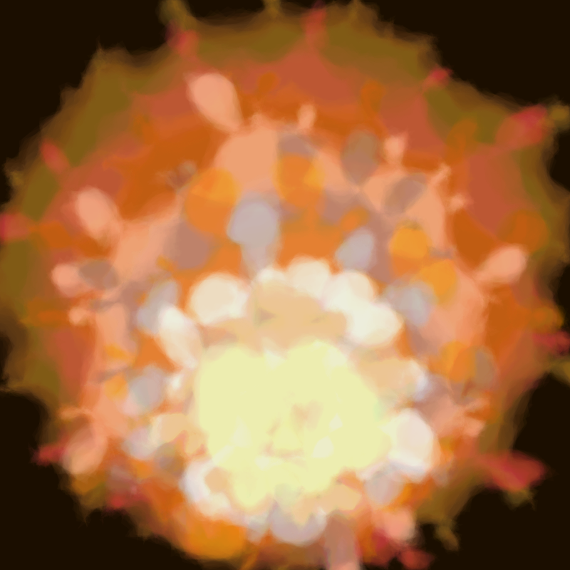
There's a fairly common technique in generative art where soft edges are produced by layering low-opacity polygons, with random variations. For the last few days I've been playing with this. I probably don't have enough distance to say anything meaningful about these, but I'm enjoying the effects so far. I particularly like the "forest".
Conclusions
It's been interesting to document how my moods and preoccupations have drifted over the month. There are themes and motifs I've kept coming back to, but the actual content has been pleasingly variable. I haven't run out of ideas yet, which is nice. I feel like the later work is more interesting to me, but that might just mean that it's closer to my current thoughts.
Overall, I'm feeling positive about the experience. I don't know if anyone else is interested in the output (although the sketch Twitter account has a hundred followers), but I'm happy with it from my own perspective, and I'm looking forward to seeing what the next month brings.
If you've enjoyed this piece, please consider contributing on Patreon so I can do more things like this.